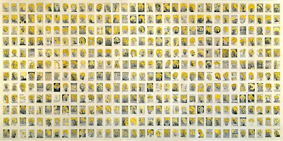
David Shrigley is a British artist
shortlisted for the Turner Prize 2013. He grew up in Leicester and did an art
foundation course at Leicester Polytechnic before going to Glasgow School of Art
and now lives in Glasgow.
Shrigley works in a lot of different
media including photography, books, sculpture, animation, painting and music.
He is probably best known for his child like drawings which combine image and
text.
Shrigley says of his own work : “
Everything should be humorous on some level. Every part of our understanding of
the world needs to be a humorous one” and “ I would say I tend to keep the
things that surprise me and chuck the things that don’t”.
David Shrigley, Headless Drummer (2012).
David Shrigley has said that he thinks
that the best way to look at his drawings is in books. Here is an example of
one of Shrigley’s books called “Why we got the sack from the museum”.
David Shrigley, I'm Dead (2010)
Shrigley has said that his influences are Philip Guston , Raymond Pettibon and Rene Magritte.
Other people have compared his work to Jean Michel Basquiat and I can see the similarities to Shrigley’s drawings.
What the critics say about the Turner
Prize and David Shrigley :-
“Why David Shrigley should win this
year’s Turner Prize. This week editor Rob Alderson reflects on the Turner Prize
nominees and nails his colours to the mast of who he wants to win.
When this year’s Turner Prize nominees
were announced, Guardian art
critic and former Turner juror Adrian Searle was quick to set out his stall. “A
world-class artist in the way that the others are not, the bottom line is that
(Tino) Sehgal is already the winner.”
His article ran with the following
introduction. “The deviser of unsettling public encounters is a world-class
artist in a way that the other contenders – Laure Prouvost, David Shrigley and
Lynette Yiadom-Boakye – are not.”
Elsewhere though, it’s the inclusion of
David Shrigley that has provoked the most discussion. Within minutes of the
shortlist being unveiled, my Twitter feed included a passionate hope that he is
named the winner come December, and an equally bombastic plea that he is not.
The latter Tweet came from someone who works within the arts and design
industry, the former did not.
I wrote a piece back in October that called on the Turner Prize to be
more open about their criteria but the inclusion of Shrigley moves this debate
on a bit.
Maybe it’s the fact that his wildly
popular show at The Hayward Gallery was such a mainstream success that some
turn their noses up at the Glaswegian master of surreal silliness. But while I
enjoyed being unsettled by Tino Seghal’s Tate Modern performance piece – where
a flock of people, ran, danced, played and approached you for whispered, random
conversations – and I am a big fan of Laure Provost, Shrigley is my clear
winner.
And it’s precisely because he
gatecrashed the mainstream consciousness that I want him to win. In the past
the Turner Prize has revelled in flagging up lesser-known exhibitions and has
done it well. But sometimes the shortlist has smacked of a certain kind of
snobbery. Shrigley’s show was joyous, funny, thought-provoking and tackled that
hoary idea of what art is. To do all this and have them queueing round the
block is certainly “outstanding” in my eyes.”
Because I have not seen any of
Shrigley’s books or exhibitions I have found it quite difficult to respond to
his work. However, when I viewed his animation ‘Headless Drummer’ (2012) on the
internet I instantly did like it and found it humorous. Since re visiting the
animation it has not had the same impact.


